

Give a chestnut! Tableau Tips (78): Learn to use common slopegraphs (slopegraph)
Tilt diagram The slopegraph (aka slash or slope plot) can show changes in a single indicator over time. It can show both the size of the value and the change in the ranking.
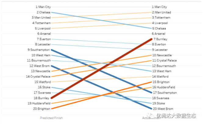
For example, in the figure below, we use the “team ranking” as an indicator to see the changes in the predicted and actual rankings of the following 20 teams. The left side is the predicted position, the right side is the actual ranking; the color indicates the ranking progress or regression (orange red indicates progress, gray blue indicates regression); the thickness of the line indicates the difference, and the thicker the line indicates that the actual ranking is larger than the prediction.
So how do you implement such a tilt map in Tableau? Let's use the example above to share the method for everyone!
In this issue of "Give a Chestnut", the Tableau technique that Ada wants to share with everyone is: Learn to use the commonly used Slopegraph.
For ease of learning, chestnuts use a simple data source for team rankings. Once you have mastered the method, you can try to implement it using your own data source.

Specific steps are as follows:
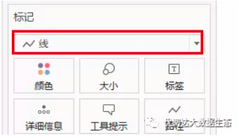
1) Create a chart
Drag the metric name to the column and the metric value to the row; mark the type selection line.
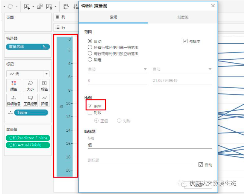
Edit the axis settings in reverse order:
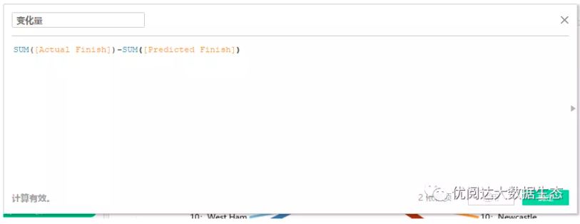
2) Create a calculated field
Create a calculated field: the amount of change and put it into the color of the tag card;
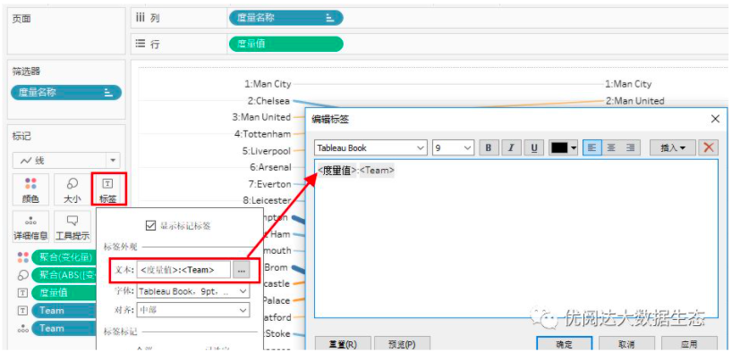
3) Edit the tag card
Place the ABS [Variable] field in the size of the tag card; drag the Team to the metric-tag-display tag;
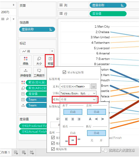
4) Modify the label
Modify the label in the tag card: text | alignment | tag tag options;
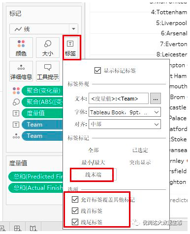
5) Adjust the details
Finally, you can check the font, color and other formats, and make some adjustments. In this way, we will complete the desired tilt map!

Today's Tableau trick, are you getting it?Open your Tableau and try it out!