

Give a chestnut! Tableau Tips (68): Making a Connected Erosion Dual-Axis Map (with full Chinese map method)...
I am @棒棒的东 , I am just a porter of knowledge! I am very happy to share some of the tips I have summarized in using Tableau with the Tableau fans on the platform of "Have a Chestnut".
Map visualization analysis is one of the data analysis skills that must be mastered for many Tableau users. We often need to use the Tableau map feature to visually analyze geographic or spatial data and collate it with other dimensions/metrics.
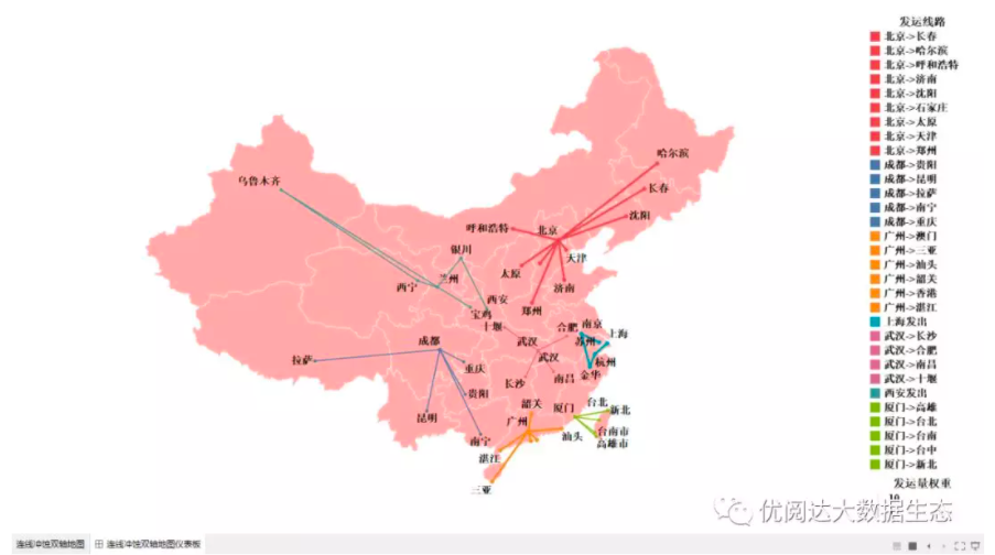
Today, the data powder @棒棒的东 The chestnuts to share for us are:Connect the erosion of the two-axis map (as shown below)). ♥ Thanks for sharing ♥
How to achieve it? Let's learn together!
In this issue of "Give a Chestnut", we will share this Tableau technique for you: making a connection to eroded a two-axis map.
Specific steps are as follows:
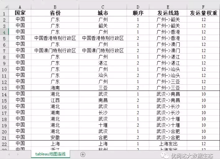
➤ Data preparation
The connection map needs to prepare a unique data form, using the data source table as shown below (data powder can be self-built data as usual, lazy cancer patients can also find Xiaoyou to obtain the data source or chestnut workbook, Xiaoyou WeChat dkmxiaoyou).
- Geospatial data: used to generate maps
- Connection sequence: for city connection path
- Connection type (here is the shipping line): The category of each connection path, used for color cards
- Weight (here is the shipping weight): The thickness of each connection, used for size cards
Tips:Before doing data visualization analysis, preparing data (data collection, data cleaning, etc.) usually takes a lot of time. The good news is the latest product from Tableau.Tableau PrepIt helps us to merge, organize, and clean up data quickly and confidently to reduce the workload of data visualization and increase productivity.
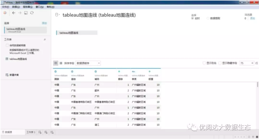
➤ Connect to the data source
Open Tableau Desktop and connect to our prepared data source file.
Set up a hierarchical structure
Set "Country-Province-City" to a hierarchical structure and set the corresponding geographic role.

➤ Generate a complete map
After double-clicking on the country, we found that the map of China is incomplete and lacks “Hong Kong Special Administrative Region of China, Macao Special Administrative Region of China, Taiwan Province of China and Tibet South Tibet”. However, China cannot be less.
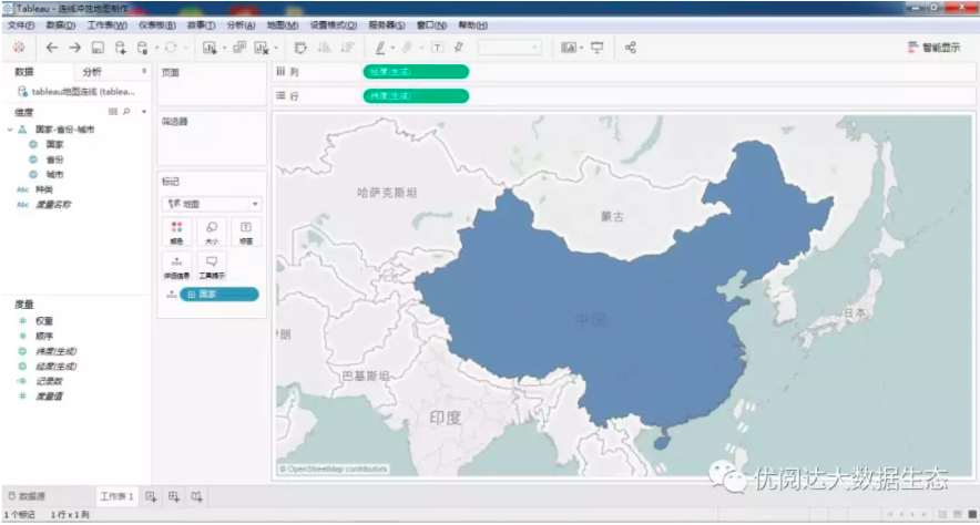
Here you need to do a small conversion: file - workbook locale - China (Chinese). In this way, the complete map of China's land is displayed.

➤ Generate province and city erosion double map
Drag "Longitude (Generate)" to the right of the existing longitude (generation) of the column, set the granularity of the detail to "City", and mark it with "Circle". The two maps set the color identification with contrast.
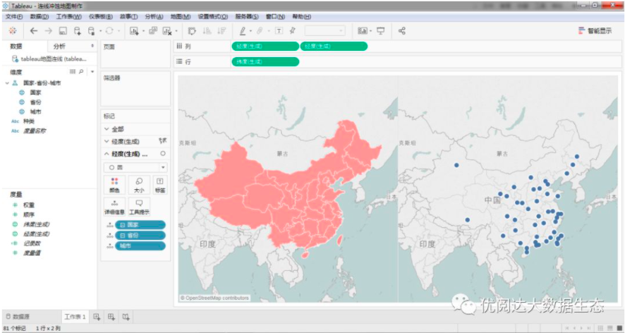
Set "Map - Map Layer - Erosion (100%)", and the erosion map will appear.
➤ Generate a line of erosion double-axis map
Action on the second map: change to "line" logo; "sequence" metric drag and drop to "path"; "ship line" dimension drag and drop to "color"; "shipment weight" metric drag and drop to "size" ".
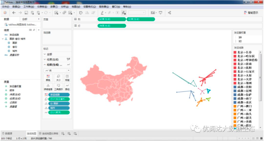
Set the two Longitude (Generate) on the column to "Double Axis"; drag and drop "City" to "Label" (not recommended when there is too much data).
In this way, a connection to the erosion of the two-axis map is complete!

Supplementary needs for chestnuts:
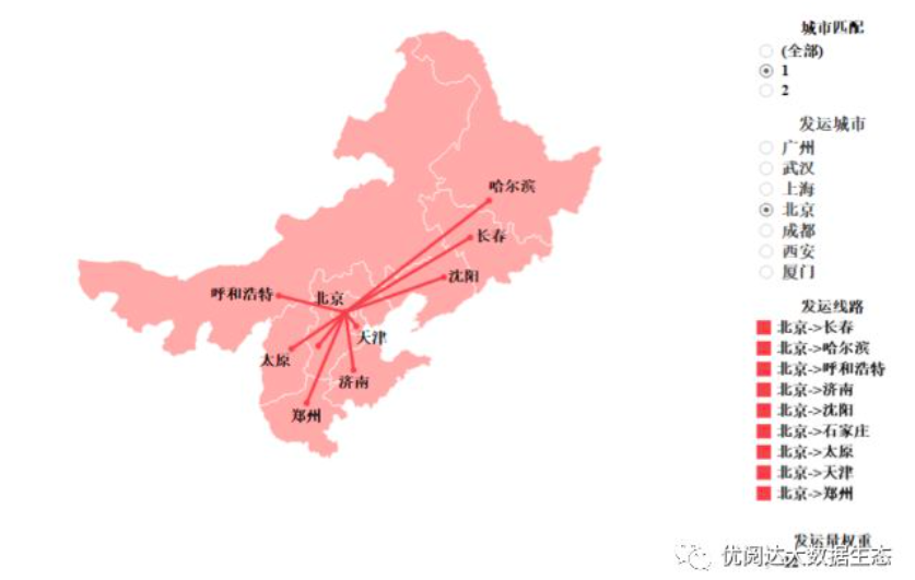
Sometimes, we will appear we wantView a city separately and send it to other citiesSituation, especially whenLarge amount of dataIf, ifView all at the same timeThe shipping situation, there will be repeated interlaced paths in the map, visualizationThe effect is obviously not ideal。
So in the current chart, can we achieve this effect? Many people may think of using filters. Using the city as a filter, we simply select "Beijing" and you will see the following results:
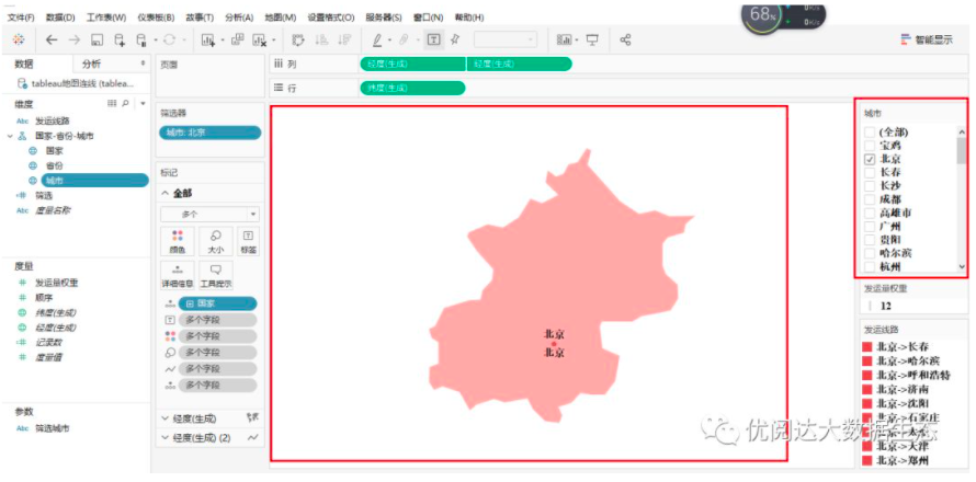
That is obviously not the result we want, everyone can think about the reason. We hope to achieve the following effects:
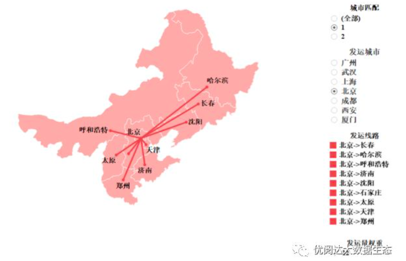
How can we achieve such a show? The method is very simple, the key is the setting of the "filter".Here we are going to filter the shipping city by setting parameters.
Specific steps are as follows:
✦ Create parameters
Create the following parameters (Note: Here is the shipping city written into the parameters, there is no special meaning, the specific chestnuts are written according to the actual situation).
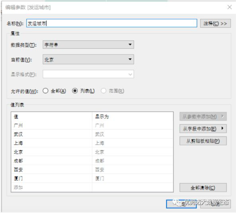
✦ Application parameter
Apply the modified parameters to the filter field; and display the parameter controls so that we can view the status of different cities separately by filtering the city.
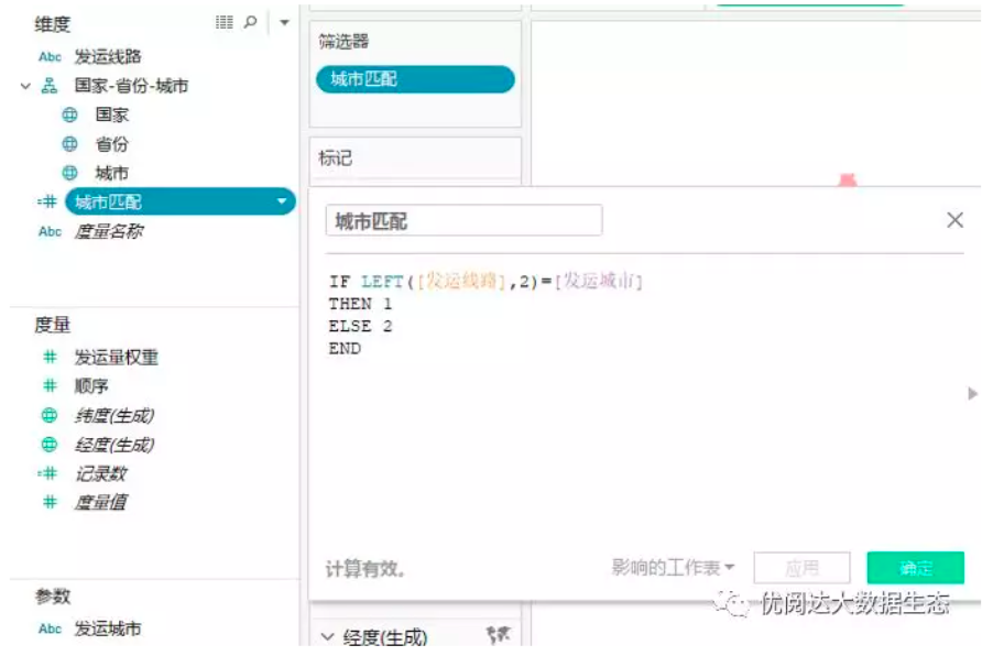
✦ Create a calculated field
Create the calculated field "City Match". The meaning of the field means: if the leftmost two strings of the shipping line match the string of the parameter, the output is "true", represented by the number 1; otherwise it is "false", with the number 2 indicates.
The City Match calculation fields are as follows:
IF LEFT ([shipping line], 2) = [shipping city]
THEN 1
ELSE 2
END
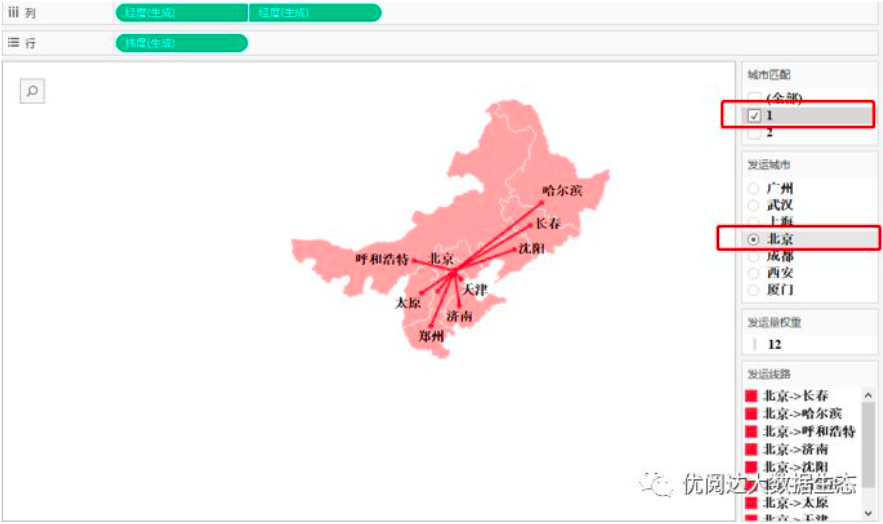
✦ Drag and drop calculated fields to filter
Drag and drop the "City Match" calculation field to the filter, and display the filter, check 1 (that is, the city matches "true"), curious data powder can also try to check 2 (yes, it is to exclude the selection) the meaning of).
✦ Set filter
Check the filter "City Match" as 1 and the parameter control "Delivery City" as Beijing. The visualization is as follows:
Place the worksheet in the dashboard and adjust the dashboard layout to get the best visualization.
Today's Tableau trick, are you getting it?Open your Tableau and try it out!