

Give a chestnut! Tableau Tips (44): Learn to combine pie charts and line charts
Yesterday, netizen @提线木偶 forward a requirement: "How to use Tableau? Pie chart + line chart? Used to analyze the overall monthly trend + the proportion of each month's classification." Not long after, he said he got it!
We suggested that he share the practice with more of his friends, so he had this chestnut. Here,We are very grateful @提线木偶.
In fact, the monthly trend used to analyze the whole + the proportion of the classification per month,Combination chart of line chart + column chartIt can also be implemented. However, from the display effect, the pie chart may be more intuitive, especially when the number of categories is relatively small.

So, how do you use Tableau to do a combination chart of pie chart + polyline?
In this issue of "Give a Chestnut", the Tableau technique that Ada wants to share with everyone is: Learn to make a combination chart of pie chart and line chart.
For the convenience of everyone, in the example, we use the supermarket data that comes with Tableau.
Specific steps are as follows:
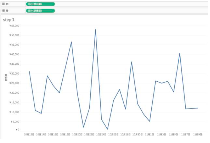
Step 1:Making a line chart
Let's start with a sales line chart that changes over time.
Step 2:Write LOD field
Then, we write a LOD field, which is used to make a pie chart.
— Why do you need to use LOD?
Because we want to add categories to the pie chart to express which categories of sales are made up of the date and what the proportions are. In order to make the pie chart and the line graph height consistent, the LOD is used to exclude the influence of the category on the pie chart during the calculation, so the EXCLUED function is used.
Tips: If you don't understand LOD, you can use sales instead of LOD to calculate the effect of the replacement.
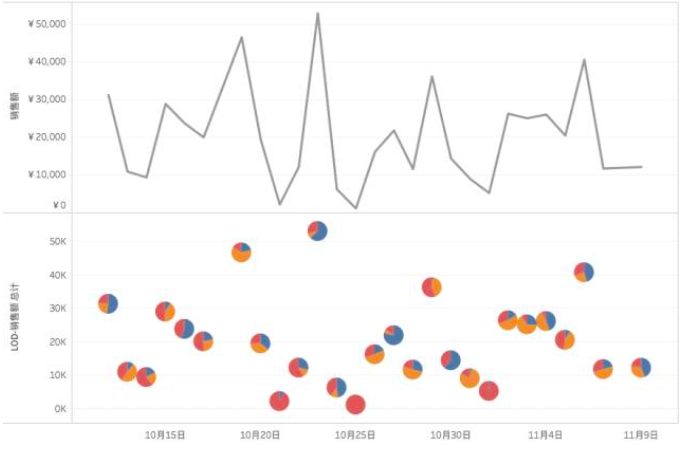
We put this field to the right of the sales and automatically change it to a pie chart in the tag card.
Drag the sales to the point of the tag and drag the category field onto the color.

At this time, the line chart and the pie chart have been completed.
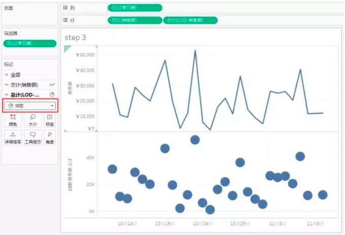
Step 3:Choose dual axis
Next, we right click on the LOD and click on the double axis.

note! If the pie chart does not fit well with the line chart at this time, it is very likely that it is not the right height.
We need to right-click on one of the axes in the two axes and select the synchronous axis (the function of the synchronous axis is to make the two axes have the same scale without deviation).
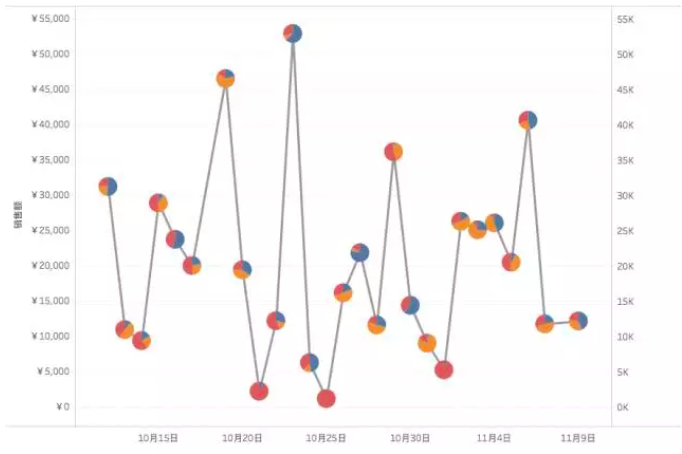
In this way, a combination chart of pie chart + line chart is completed, it is pretty pretty!
Today's Tableau tips, are you getting it? Open your Tableau and try it out!