


 400 998 0226
 Tableau


 Tableau
 Minitab


 Alteryx


 Neo4j
Neo4j


 Talend


 IM
IM


 华为云
华为云 腾讯云
腾讯云 IT/安全
IT/安全


Lift a chestnut! Tableau Trise (138): Learn to make a cool thermometer chart
Meteorological analysts from Beijing have given a demand: I often analyze temperature data, can Tableau achieve pictograms like thermometers?

Of course, the thermometer chart can be achieved in Tableau! And, it can not only be used to present temperature data, but also to the scenes such as the standard ratio!
The standard rate analysis scene can also be used with the target map (targeting), or more eye-catching round head target map.
Today, let's share: How to achieve a cool thermometer chart in Tableau!
The Tableau tricks we have to share with you this issue are: learn to make a cool thermometer chart.
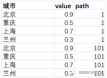
For convenience, chestnuts use a more simple homemade data source (as shown below). After mastering the chestnut method, the data powder can try to use its own data.
Specific steps are as follows:
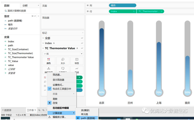
1. Open Tableau Desktop, connect the chestnut data source, and create a new worksheet.
2. In the "Data" pane, right click "Path", select "Create" - "Data Bucket" in the drop-down menu, set the size of the data bucket to: 1.
Create a calculation field: INDEX, right-click the "Data" pane, select "Create" - "Create Field" command in the drop-down menu, type function:
INDEX()-1
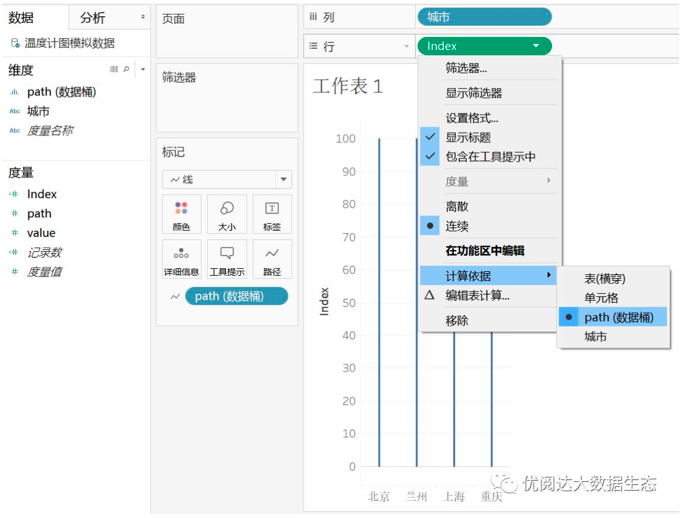
Drag and drop the dimension "City" to the column, put the dimension "path" and the calculation field "index", drag and drop, select the tag type "tag" card to: Line.

3. Drag and drop the "Path" capsule on the line to the "Path" of the "Mark" card. Right click on "INDEX" capsules on the line, in the drop-down menu, the calculation is selected as: PATH (data barrel).
Create a calculation field: TC_Value, type function:
WINDOW_MAX(MAX([value]))
Create a calculation field: TC_THERMOMETER VALUE, type function:
[Index]*[TC_Value]
Drag and drop the calculation field "TC_THERMOSETER VALUE", then right-click the capsule, and calculate the calculation based on the drop-down menu: PATH (data barrel).

4. Create a calculation field: tc_size (container), type function:
IF [Index] = 0 THEN 1 ELSE 0 END
Create a calculation field: tc_size (Thermometer), type function:
IF [Index] = 0 THEN 1 ELSE 0 END
In the "Index" tag, click Color, set the color to: gray.

Drag and drop the calculation field "TC_SIZE (Container" onto the "Size" of the "Index" tag card. Click the drop-down menu of the top of the working table view, select Edit Size. Then in the pop-up dialog box, the adjustment tag size ranges to the appropriate, click OK.

Drag and drop the calculation field "TC_SIZE (THERMETER)" on "size" of the "TC_thermometer Value" tag card.
Right click on the "TC_THERMOMETER VALUE" capsule, select "Dual-axis" in the drop-down menu. Right click on any longitudinal axis, select "Synchronous Axis".
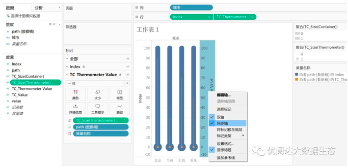
Right click on the axis on both sides of the view and uncheck "Show Title". The color of the metric name is removed in the "Index" tag card and "TC_thermometer Value" tag card.
Edit the "TC_SIZE (THERMOMETER) legend, adjust the size to the right.
Drag and drop the metric "Value" on the Tag "tag" tag card. As shown below, set the logar of the VALUE tag, the label tag, the font size, and color and other formats.
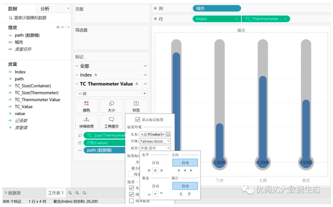
Then, right-click this "sum" capsule, select Set Format, set the number to a percentage.

Drag and drop the calculated field "TC_THERMOSETER VALUE" color "in the" TC_thermometer Value "tag card. Right click on this capsule and set the calculation basis: path (data barrel).
In this way, we have completed an intuitive and cool thermometer chart!

This issue of Tableau skills, have you get? Try it quickly!