

Our Service
Enterprise Digital Innovation Solution Provider


Customer Story


FAW Volkswagen
Tableau helps FAW Volkswagen upgrade management and improve efficiency, empowering traditional car companies in their digital transformation.


East Asia Qianhai
Tableau helps East Asia Qianhai Securities revitalize data assets and accelerate digital transformation.


Ruian Xintiandi
Ruian Xintiandi’s second BI self-service analysis competition concluded successfully, helping to improve business quality and efficiency.


Yuexiu Group
Data-Driven enterprise management, Yuexiu Group BI implementation successful acceptance of the second phase of the human resources themed project.


Chongqing Little Raindrops
Chongqing Xiaoyudian joins hands with Neo4j to help improve financial service experience.


Sofia Home
DataGPT helps Sophia Home accelerate intelligent data insights, intuitively understand data correlation trends and quickly make data-driven business decisions.


Mindray
The Python introductory training camp has successfully concluded, helping Mindray accelerate its digital transformation.


Shanghai Pudong Development Bank
Data talks about the future and empowers business Shanghai Pudong Development Bank Wuhan Branch data analysis Tableau training camp ended successfully.
DKM Partner Network
DKM has an extensive partner network, including some well-known companies in infrastructure, data governance storage, data consumption and other fields. Through integration, we ensure we can deliver a powerful, end-to-end modern analytics solution and allow you to leverage your existing technology investments.


Enterprise Digitalization Service

Infrastructure Backup
Through Youyuda cloud data application solutions, enterprises can more calmly cope with data challenges on the cloud relying on the powerful computing, storage, database and other infrastructure technologies of the cloud platform, enterprises can strengthen the management of massive data assets and tap the potential to achieve cost reduction. The sustainable development goal of increasing efficiency; with the help of emerging technologies such as machine learning, artificial intelligence, data lakes, analytics, and the Internet of Things, enterprises can build richer digital intelligent applications and renew business value faster.

Data Governance and Storage
Through leading technologies such as data weaving, data virtualization, intelligent multi-dimensional databases, and one-stop cloud indicator middle platform, Ureada can help enterprises enhance the reliability and availability of data architecture, establish a strong data strategy and effective Data governance mechanism accelerates intelligent connection and analysis efficiency of business data.

Data Consumption
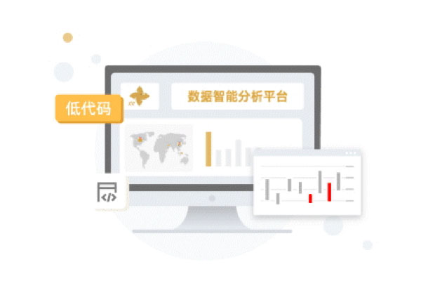
In order to deal with the problems of inefficiency, high cost, chaotic management, and insecurity in the construction process of enterprise data consumption applications, Uyuda provides a variety of low-code data modeling, intelligent data search, self-service data analysis, and high-quality data integration. Innovative solutions can help enterprises break down data consumption barriers to the greatest extent and enhance the core capabilities of data-driven business.

AIGC
With the continuous advancement of artificial intelligence technology, AIGC can generate higher quality, more diverse, and more personalized content to meet various needs and scenarios of enterprises. Youyuda AIGC solution will efficiently help enterprises realize a variety of intelligent applications, improve production efficiency and service quality, reduce costs and error rates, and enhance the competitiveness and innovation capabilities of enterprises.

SaaS
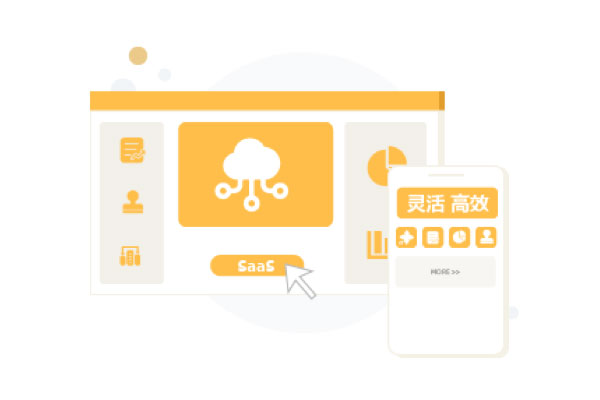
SaaS applications do not require a large upfront investment in hardware and software, saving corporate costs while also helping them quickly achieve informatization. Moreover, SaaS applications do not require enterprises to have professional IT personnel and can use the latest digital technologies at any time to maximize the needs of enterprises for information management. Youyueda provides a variety of flexible SaaS solutions, which will help enterprises reduce costs and increase efficiency, and enter the era of efficient digital management.

Data Empowerment
In the era of big data, data creativity has become an essential skill for professionals and a key factor in the digital transformation of enterprises. Youyueda Digital Innovation Academy is committed to building and improving data creativity for organizations and individuals. Through continuously optimized courses and training, it can continuously improve data and creativity for organizations and individuals at multiple levels such as attitudes, skills, and knowledge; Empower businesses through digital training, help professionals improve their data literacy, and help companies build a data ecosystem.
Business Distribution


