


 400 998 0226
 Tableau


 Tableau
 Minitab


 Alteryx


 Neo4j
Neo4j


 Talend


 IM
IM


 华为云
华为云 腾讯云
腾讯云 IT/安全
IT/安全


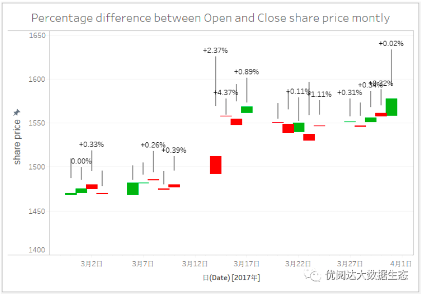
Lift a chestnut! Tableau Trise (131): Analytical price fluctuations with candlestick map Candlestick Chart
Candlestick Chart, also known as a candle map or K-line diagram, is a price chart that is often used to show the highest, lowest, open price and closing price of a certain securities in a particular period.
For example, the stock price fluctuation analysis chart: Green represents the stock price, red represents the stock price fell; the crude column height represents the difference between the opening price and the closing price; the height of the fine column represents the difference between the highest price and the lowest price.

Today we share: How to implement candlestick chart in Tableau, take a look!
The Tableau tricks we want to share with you this issue are: Use candlestick map Candlestick Chart to analyze prices fluctuations.
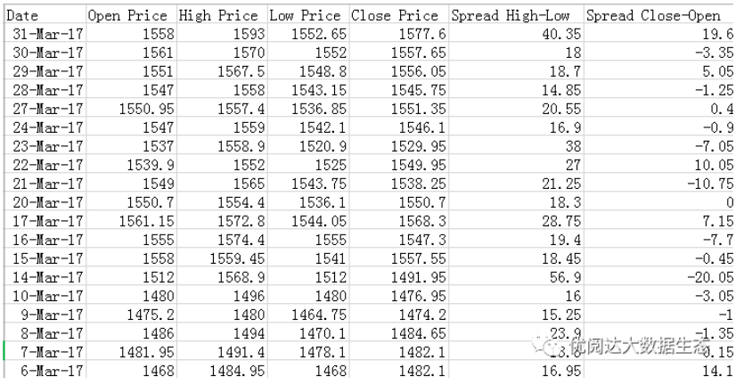
For easy learning, chestnut uses a data source we prepared on the stock price (as shown below). After mastering the chestnut method, the data powder can try to use its own data.
Specific steps are as follows:
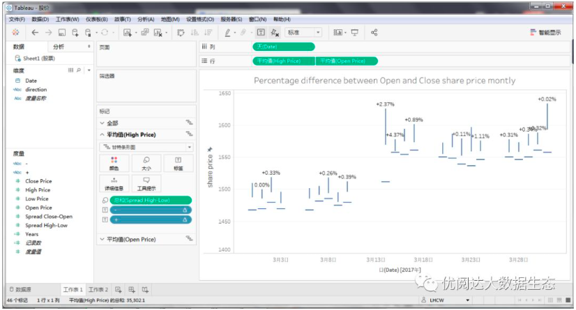
01, create a gansteragram
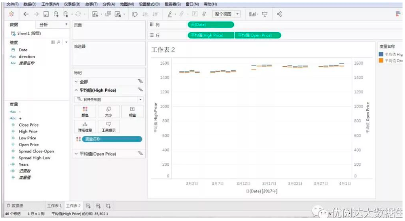
Open Tableau Desktop, connect the chestnut data source, create a new worksheet. First, we need to create a gansteragram.
l Drag and drop the dimension "Date" to the column, right click "Date" capsules on the column, in the drop-down menu, select "Day"; repeat the above steps, then select "Discrete";
l Drag and drop the metrics "High Price" and "Open Price" respectively, right click "High Price" and "Open Price" capsules on the line, select "Measure" in the drop-down menu;
l The graphic is selected as "Ganstera Map" in the "Tag" card of the "High Price" and "Open Price".
l Right-click on the vertical axis, in the drop-down menu, select "Dual-axis"; repeat the above steps, then select "Sync axes".
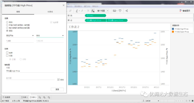
At this time, we need to edit the shaft scale due to the graphical vertical axis value or more. Right-click the vertical axis and select "Edit Ax) in the drop-down menu.
In the pop-up "Edit Shaft [Average High Price] dialog box, the range is selected as" fixed "and set the fixed start and fixed value on demand, so that the trend of the chart will be more obvious.
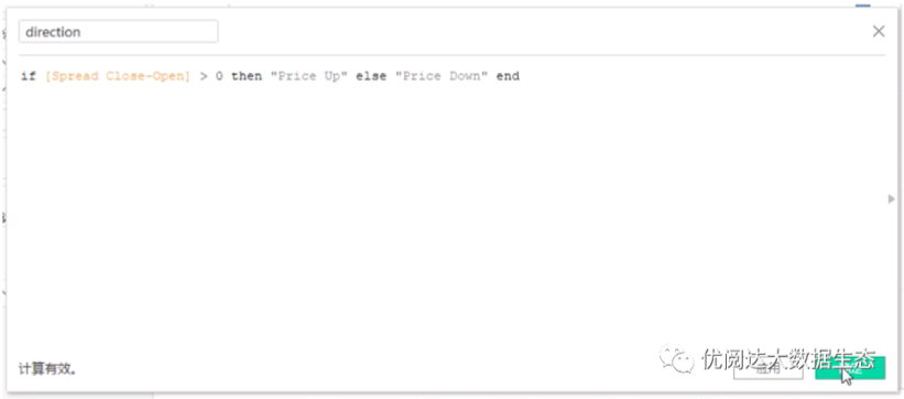
02, create a calculation field
Next, we need to create several calculation fields. In the data pane, right click on the blank, select "Create" - "Calculate Field" in the drop-down menu.
l Create a calculation field "direction", the function is as follows:
if [Spread Close-Open] > 0 then"Price Up" else “Price Down” end
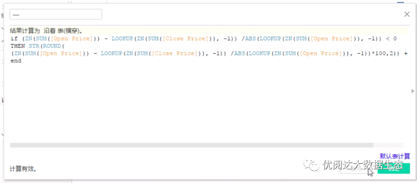
l Create a calculation field "-", the function is as follows:
if (ZN(SUM([Open Price])) -LOOKUP(ZN(SUM([Close Price])), -1)) /ABS(LOOKUP(ZN(SUM([Open Price])), -1))< 0
THEN STR(ROUND(
(ZN(SUM([Open Price])) -LOOKUP(ZN(SUM([Close Price])), -1)) /ABS(LOOKUP(ZN(SUM([Open Price])),-1))*100,2)) +’%’
ELSE ‘’ END
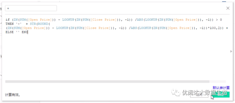
l Create a calculation field "+", the function is as follows:
if (ZN(SUM([Open Price])) -LOOKUP(ZN(SUM([Close Price])), -1)) /ABS(LOOKUP(ZN(SUM([Open Price])), -1))> 0
THEN ‘+’ + STR(ROUND(
(ZN(SUM([Open Price])) -LOOKUP(ZN(SUM([Close Price])), -1)) /ABS(LOOKUP(ZN(SUM([Open Price])),-1))*100,2)) +’%’
ELSE ‘’ END
03, create candlestick map
Drag and drop the metric "SPREAD HIGH-LOW" in the "High Price" tag card; drag and drop the calculation field "-" and "+" drag and drop to the "high price" tag card "Tag".
Drag and drop the metric "SPREAD CLOSE-Open" in "size" "tag card; drag and drop the" Direction "tag card" Color "tagged to the" Open Price "tag card in.
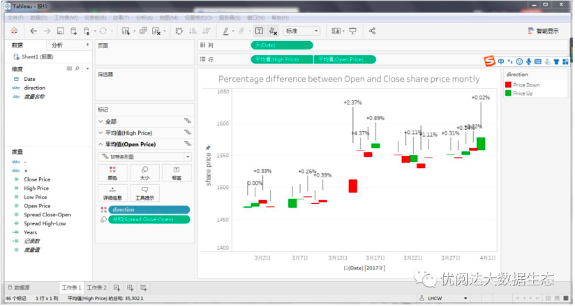
Finally, take some time, check the font, color and other formats, and do some adjustments on demand.
In this way, we complete the following stock price fluctuations to analyze candlestick map!
This issue of Tableau skills, have you get? Try it quickly!