


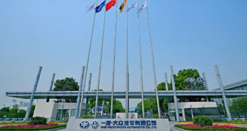
FAW Volkswagen
Tableau helps FAW Volkswagen upgrade management and improve efficiency, empowering traditional car companies in their digital transformation.

East Asia Qianhai
Tableau helps East Asia Qianhai Securities revitalize data assets and accelerate digital transformation.

Ruian Xintiandi
Ruian Xintiandi’s second BI self-service analysis competition concluded successfully, helping to improve business quality and efficiency.

Yuexiu Group
Data-Driven enterprise management, Yuexiu Group BI implementation successful acceptance of the second phase of the human resources themed project.
Chongqing Little Raindrops
Chongqing Xiaoyudian joins hands with Neo4j to help improve financial service experience.
Sofia Home
DataGPT helps Sophia Home accelerate intelligent data insights, intuitively understand data correlation trends and quickly make data-driven business decisions.
Mindray
The Python introductory training camp has successfully concluded, helping Mindray accelerate its digital transformation.
Shanghai Pudong Development Bank
Data talks about the future and empowers business Shanghai Pudong Development Bank Wuhan Branch data analysis Tableau training camp ended successfully.