


 400 998 0226
 Tableau


 Tableau
 Minitab


 Alteryx


 Neo4j
Neo4j


 Talend


 IM
IM


 华为云
华为云 腾讯云
腾讯云 IT/安全
IT/安全


Give a chestnut! Tableau Tips (50): Use the Index function to view data category details
"Give a chestnut" has been pushed to the 50th issue, can not help but sigh time!
What makes us happy is:More and more Tableau users are joining, and they are willing to share their learning income with more data powder.
Today this? , from Shanghai Gao RuiXin's sharing.
♡ Thanks, remember, more than nothing...
In the daily work, the analysis of business data, not only know the overall situation. Sometimes it's easier to find the problem by looking at the data category details.
However, it is not a simple matter to visually view the details of a data category.
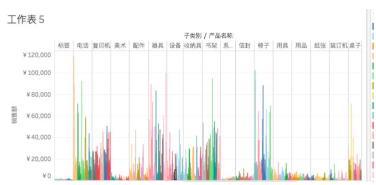
At the beginning, it was difficult for me to make the product category, subcategory, and product name appear on the same worksheet at the same time.
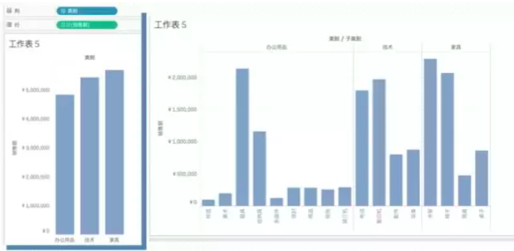
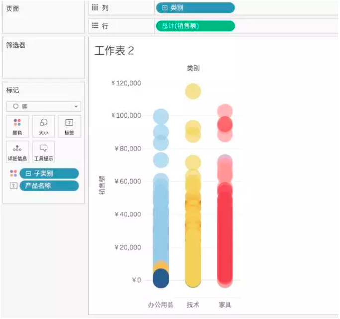
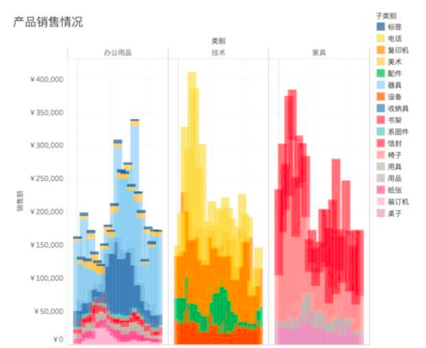
Later, I found that when the category is relatively small, the bar chart below can also present the data category details. However, once there are so many categories, you need to find another way.
In the case of a large number of categories, the following scatter plots are more intuitive than the bar chart: you can clearly see the sales of each product category under each major category (each point represents one) Products, different colors represent different subcategories).
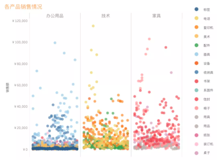
Usually, scatter plots require multiple metrics to implement, but there is only one metric in my requirements.
So how do scatter plots like "one metric + multiple dimensions" be implemented like this? The answer is: use the Index function.
In this issue of "Give a Chestnut", the Tableau technique that Ada wants to share with everyone is: Use the Index function to view the data category details.
For the convenience of learning, we use the supermarket data source that comes with Tableau.
Specific steps are as follows:
Step 1:drag and drop fields to generate a bar chart
After importing the sample-supermarket data, drag and drop the Category and Sales fields to the column and row ribbons respectively to generate a bar chart.
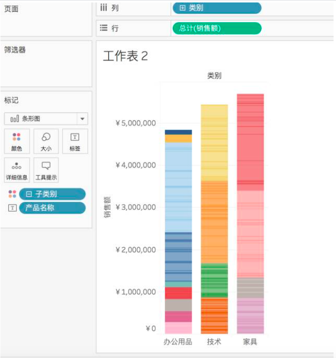
Step 2:change the bar chart to a circle
In the marker bar, change the bar chart to a circle.
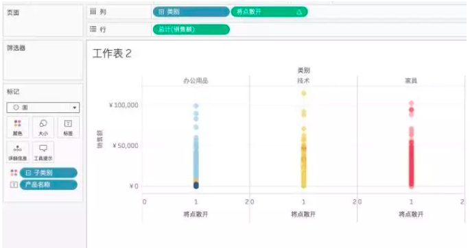
Step 3:create an Index calculation field
Next, we create a calculated field using the Index function.
The number in the formula represents the number of columns of scatter points. Here I hope that the scatter points that are presented can be arranged in a denser order, so I mark 25.

Step 4:put the created fields in the columnFunctional area
Step 5: set the calculation basis
This is a very important step, you need to set the calculation basis of the calculated field (as shown below).
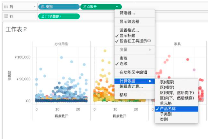
Set the calculation basis so that the points spread out according to the product name. Otherwise, these points will be on the same line (as shown above).
In this way, using the Index function, I got a scatter plot that visually looks at the details of the category.
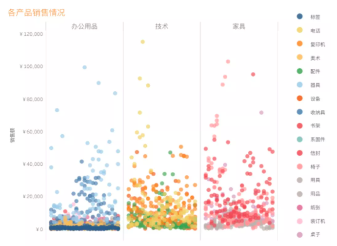
Tips:If you don't like the dot, you can change the circle to a bar chart in the marker bar, and you can get another display effect~
Today's Tableau trick, are you getting it? Open your Tableau and try it out!