Give a chestnut! Tableau Tips (15): Use the Last function to view consumption data
-Ada, hello! I ask: How can I see the most recent data for a dimension?
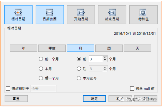
– Hello there! This simple, the time onto the filter, select relative date, then you can filter out in recent months or weeks of the data it.
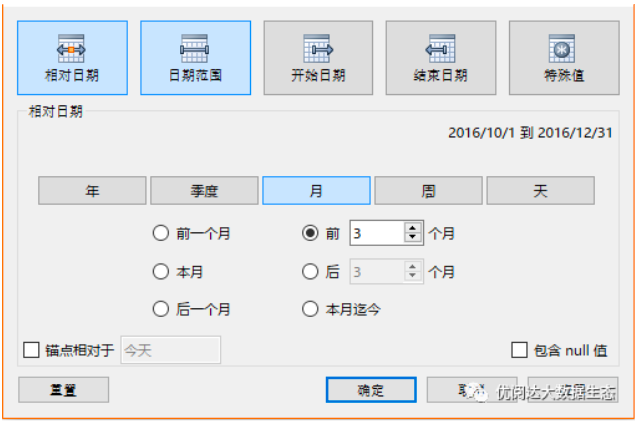
-This dimension data inside the end time is not the same ah, some data is not updated on the end of a few months ago, some data has also been updated. Filters can only filter the most recent time, some have ended, but I want to see what the end of it and the data before the end of this time should be how to do it?
– Oh I see. This time, we must use the last () function it!
This issue “For chestnut,” we need to give Ada sharing Tableau skills are: Magical Last function to see consumption data.
If you are a client manager, I would like to know the last few years, each customer’s consumption. However, these customers scattered in different regions, different areas of the data update time, and even some updated data has ended.
Starting last time consumption point of time for each customer’s monthly consumption units (N pen monthly consumption counted only once), forward backwards. Look at their last six pen consumption, respectively, at what time? This really can not be achieved by simple screening.
Here, you can try the following steps to help you with the Last function get the desired results.
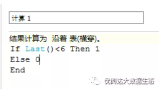
Step 1:Create calculated fields
Computing field, Last () refers to the closest data 6 represents the number of most recent data.
Calculated field which means that, if the data is the last six times, the output 1, and if not, 0 is output.
Step 2:The date into the columns
To the list of data as well as into some other date, select dates consecutive month, as shown below:

Step 3:Put data into rows
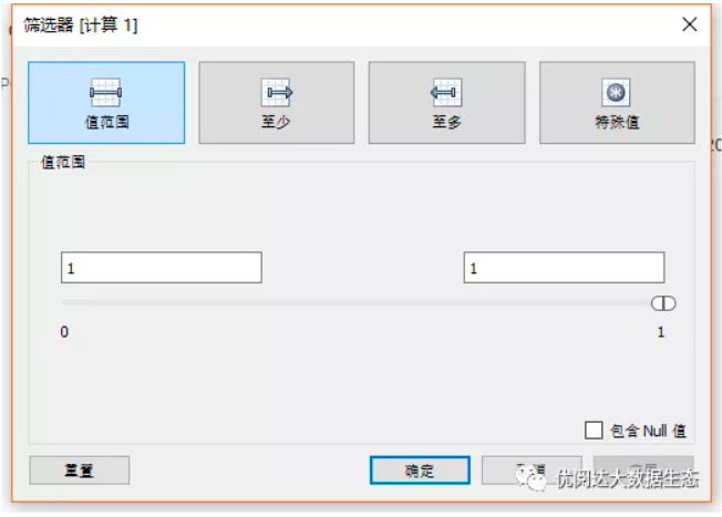
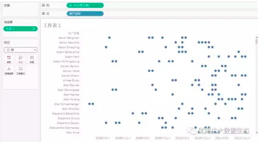
I want to see the data line onto the inside, then the “Calculation 1” onto the filter, select the value 1. Figure:
Now, you can see each customer last six months of consumption distributed.
Worksheet, the vertical axis is the customer name, the abscissa is time point; every little dot on behalf of the client in the month there is a consumer; the mouse on any of a small dot, the client will appear when the time spending time and the amount of other information.
By chart we can clearly see:
l Which customers have long been the consumer, after a long stagnation, once again produced a consumer;
l Consumer-month period which customers distributed more evenly, very cyclical;which customers only recently started spending, but the frequency of consumption is very high;
l So that consumers are well documented life cycle, through intuitive charts can bring you a lot of thinking, and thus to identify problems and develop strategies to solve the problem. This is the largest data visualization charm!
Today’s Tableau little skill, you Get to it?
