

Give a chestnut! Tableau Tips (30): Cleverly implement a combination chart of a two-column chart and a line chart
Recently, many Tableau users have feedback: "I want to make a chart like this (as shown below), orange represents last year's performance, blue represents this year's performance, and the curve represents growth rate. However, I have tried repeatedly and can't always do it. ""

In fact, the chart itself is not complicated, it is a combination chart of two histograms and one graph. But in Tableau you want to achieve such a rendering result, still need some skills.
thisThe "Take a Chestnut", Ada's Tableau technique to share with you is: a clever combination of a two-column chart and a line chart.
The methods implemented differ according to the data structure.
Specific steps are as follows:
【method one】
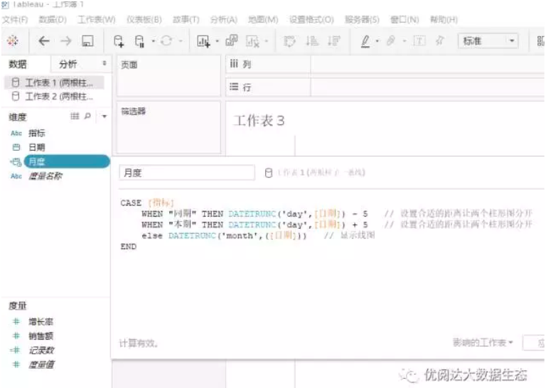
Step 1:adjust the data structure
First, the data structure needs to be adjusted. The structure is as follows (the fields such as time and specific indicators are modified according to the actual scene).

Step 2:Import data into Tableau
Import the data from this structure into Tableau and process the date field:
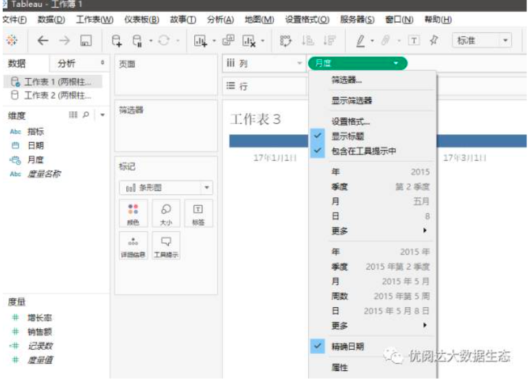
Step 3:Drag the date field into the column
Next, drag the newly defined date field to the column and select the exact date:
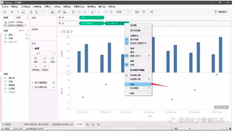
Step 4:Drag the Sales and Growth fields to the line.
Drag the Sales and Growth fields to the row, one to select a selection line for the column:
Step 5:Drag the indicator field into the color
At this point we will find that the growth rate shows a point, not a line. Don't worry, we can drag the indicator field into the color:

Step 6: eliminate the null value
Some small partners may find that there are several null values in the lower right corner. That is because in order to make the map in tableau, the corresponding adjustment of the data structure will not affect the real data. To eliminate the null value, just right-click on the null prompt and choose to hide the prompt.
Step 7: modify the details
Finally, modify the details of the tips, colors, etc. according to your own situation:

【Method Two】
Step 1: using common data structures
The following data structures are more common:

Step 2:drag out the column chart
First, drag the date field to the column and select the month, then drag the measure sales field to the row, and finally place the dimension indicator field on the color marker card.

Step 3: write the calculation field
Second, write a field about the growth rate, pay attention to the time to select the current year, and drag the field to the line, the mark is changed to a line:

Step 4: Drag the date field to the line graph color marker card
At this time, after the double axis, it is still a discrete point. Then you just need to drag the date field to the color chart card of the line drawing:

Today's Tableau trick, are you getting it?Open your Tableau and try it out!