
Give a chestnut! Tableau Tips (70): Learn to make fashionable circular bar graphs (runway graphs)
In Tableau, how to make a ring bar chart? We use a simple chestnut (pictured below) to share the method.
In this issue of "Give a Chestnut", we will share with you this Tableau technique: learn to make fashionable circular bar graphs (track graphs).
Step 1:Data source preparation
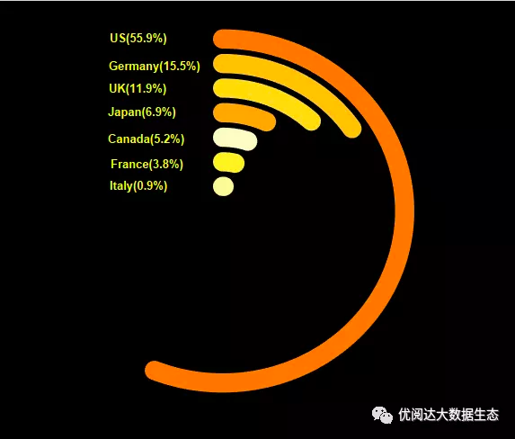
In order to facilitate everyone's learning, use excel to prepare data for the four cities of Beijing, Shanghai, Guangzhou and Shenzhen. It should be noted that the ds field in the data represents the path of the runway map, and the category field represents 4 cities.
Then import the data into Tableau to start the production of the runway map (data fans can build their own data as usual, and patients with lazy cancer can also find my private message to get the data source).

Tips: The length of the ring bar mainly depends on the ds field in the data source, not the percentage of achievement rate. The path length is not necessarily from 0 to 23, depending on the analysis requirements.
Step 2:Create X, Y axis
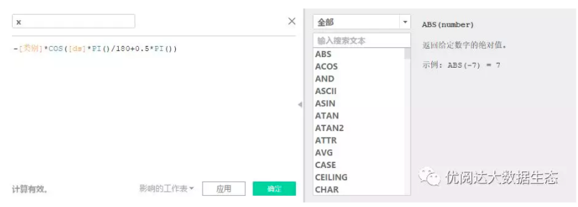
First, create the calculation fields for the x and y axes. This is the most important step. Set the x and y axes to specify the angle in radians.
X axis: -[Category]*COS([ds]PI()/180+0.5PI())
y-axis: [category]*SIN([ds]PI()/180+0.5PI())

Step 3:Create a calculation field for the% achievement rate
Create a calculation field for the achievement rate %, the achievement rate: SUM([Actual Value])/sum([Target Value]).

Step 4:Create a ring bar chart
We put the calculated fields of X and Y into the rows and columns respectively, put the color in the city field, change the line in the mark card, and put ds into the path of the mark card.
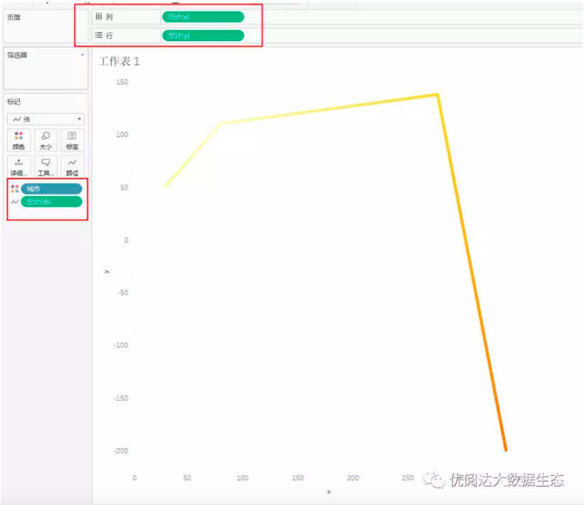
At this time, it becomes a straight line, not a circular line. Why? If you look closely, you will find that the four points on the current line are the result of the aggregation of the X and Y axes of the four cities.
Step 5:Cancel aggregation
Click the analysis menu in the menu, there is an aggregate measure that has been checked by default, we click again to cancel the check, and then look at the graph and it has become a ring-shaped line.

Step 6:Complete the ring bar graph
Finally, put the percentage of achievement rate and other fields into the label to display, and then adjust it later, and the bar graph will come out.

Open up your Tableau and give it a try!