Give a chestnut! Tableau Tips (65): Teach you to create a bar chart in the map Ada
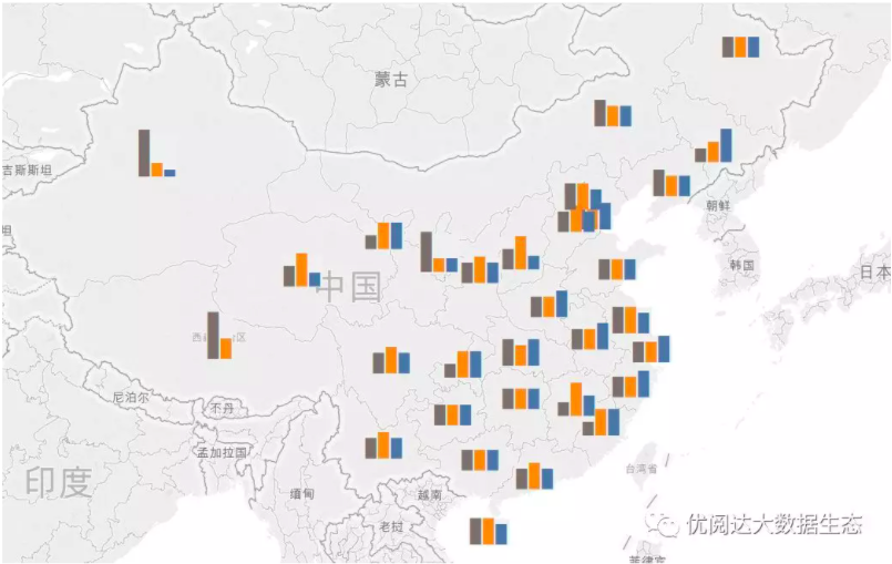
Before Tableau 10.5 was released, we had a chestnut to teach everyoneHow to display a bar chart in a tooltip. At the end of the chestnuts, I left an assignment for everyone: how to display a bar chart on the map (as shown below).

Recently, there was data powder feedback: Ada, I got the bar graph in the tooltip bar in Tableau 10.5. However, how to display it on the map is still not researched! Teach me~
Careful data powders may find that Tableau has a built-in option for symbols on the map and pie charts on the map, but there are no standard bar chart options on the map.
That being the case, let's teach you how to create a bar chart on the map!
In this issue of "Give a Chestnut", the Tableau technique that Ada wants to share with you is: teach you to create a bar chart in the map.
For the convenience of learning, chestnuts will use the supermarket data source that comes with Tableau.
Specific steps are as follows:
Step 1:create a calculated field for the bar chart
This step of operation, andHow to show a bar chart in a tooltip with a chestnut (37)The method is the same, we need to create a field for each category of sales. Calculated as follows:
Calculated field name: sales-office supplies
IF [Category] ="Office Supplies" THEN [Sales] END
Calculated field name: sales-furniture
IF [Category] ="Furniture" THEN [Sales] END
Calculated field name: sales-technology
IF [Category] ="Technology" THEN [Sales] END
Next, create three more fields that correspond to the displayed column chart as follows:
Calculated field name: column string - office supplies
LEFT ("██████████", ROUND(SUM([sales-office supplies])/SUM([sales])* 10,0))
Calculated field name: column string - furniture
LEFT ("██████████", ROUND(SUM([sales-furniture])/SUM([sales])* 10,0))
Calculated field name: column string - technology
LEFT ("██████████", ROUND(SUM([sales-technology])/SUM([sales])* 10,0))
Note: In order to better display the map, this number is rounded to the nearest 10 instead of 100.
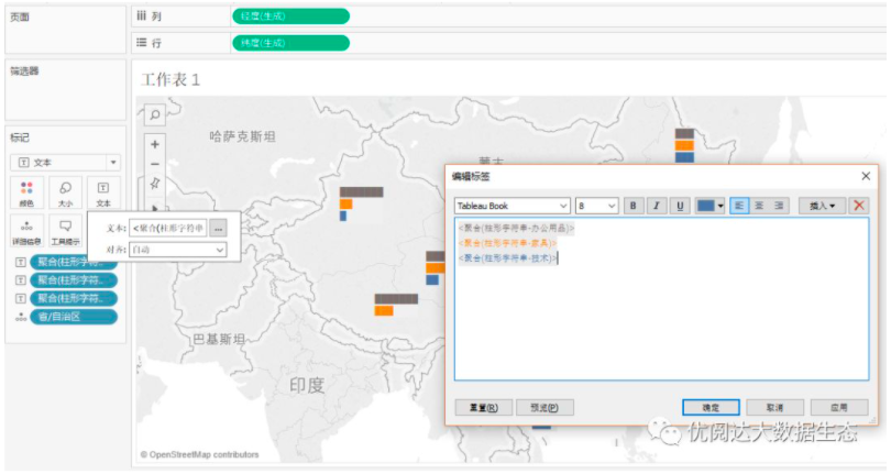
Step 2:establish a map
Change the geographical role of the province to the province/city/autonomous region, double-click the province, which will automatically generate longitude and latitude on the rows and columns.
Change the tag drop-down box to text.
Drag the column string field to the text: Column String - Office Supplies, Column String - Furniture, Column String - Technology. Click on the size and shrink it as much as possible.
Now, there are 3 bars on your map that represent the percentage of each category in the province.
Step 3:set the text format of the bar chart
Here, you can set the bar chart to the desired style according to your needs: horizontal display, vertical display or stacked display.Horizontal bar chart on the map:
》Click on the text and select the Align drop-down menu;
Set the horizontal alignment to the left;
Select all the text and set the font size to 8 and change the color to the color of the bar chart in the bar chart.
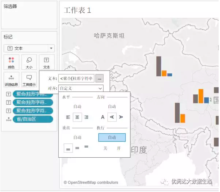
》Vertical bar chart on the map:
For vertical bar charts, we only need to adjust the text alignment;
Click on the text and select the Align drop-down menu;
Set the text direction alignment to up;
Set the vertical alignment to the bottom.
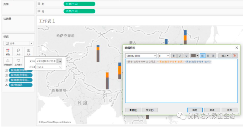
》Stacked bar chart on the map:
For stacked bar charts, simply place all the labels on the same line and adjust the text orientation to normal or up to get a horizontal or vertical stacked bar chart.
Today's Tableau trick, are you getting it?Open your Tableau and try it out!